The Quiet Evolution of Web Design
Web design rarely changes overnight, and that is part of its charm, because the shifts we see today are the result of small, thoughtful adjustments made by countless designers who care about how a person feels the moment a page loads. Instead of chasing trends for their own sake, many are returning to the basics of clarity and comfort, choosing layouts that breathe and colors that soothe rather than shout. This steady, patient evolution is what most of today’s web design news is really about, a quiet return to design that respects the visitor’s time and attention, one small decision at a time.
Why Simplicity Is Winning Over Complexity
For years, websites competed to look busier, brighter, and more elaborate than the last, but that race has slowed as designers realize that simplicity often communicates confidence far better than clutter ever could. A clean homepage with clear navigation tells a visitor exactly where to look, without asking them to work for it. This shift toward simplicity is not about doing less, but about doing only what truly matters, so that every element on the page has a reason to be there and nothing feels like unnecessary noise pulling attention away.
Mobile First Is No Longer Optional
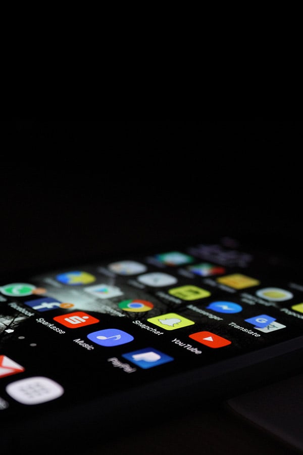
There was a time when designing for mobile screens felt like an afterthought, something added once the desktop version was finished, but that order has completely reversed. Most visitors now arrive on a phone before they ever open a laptop, so designers begin with the smallest screen first and build outward from there. This mobile first approach shapes everything from button size to menu structure, ensuring that a thumb scrolling through a bus ride feels just as cared for as a mouse gliding across a wide monitor at a desk.
Accessibility Takes Center Stage
One of the most meaningful shifts in recent web design news is how seriously accessibility is now being treated, not as a legal checkbox but as a genuine act of hospitality toward every visitor. Designers are paying closer attention to color contrast, readable fonts, and navigation that works for someone using a screen reader or relying on a keyboard alone. This growing awareness means that more websites are welcoming to more people, regardless of ability, and that inclusivity is slowly becoming a quiet standard rather than a rare, occasional exception.
The Rise of Warm, Human Centered Color Palettes
Cold, corporate color schemes are gently giving way to warmer, more human palettes that feel less like a boardroom and more like a conversation with a friend. Soft terracottas, muted greens, and gentle creams are appearing across industries that once relied only on sharp blues and grays. These choices are not accidental; they reflect a broader desire for websites to feel approachable and calm, inviting a visitor to linger a little longer instead of feeling rushed along by cold, clinical tones on the screen.
Typography That Speaks Softly But Clearly
Typography has quietly become one of the most powerful tools in a designer’s hand, capable of setting a mood before a single word is even read by a visitor. Rounded, friendly typefaces are replacing rigid, overly formal fonts, especially on websites that want to feel personal rather than distant. Spacing between lines and letters is also receiving more care, giving text room to breathe so that reading feels effortless rather than like a chore, gentle on the eyes from the very first glance at the page.
Page Speed as a Sign of Respect
A slow loading website has always been frustrating, but today it is increasingly understood as a small sign of disrespect toward a visitor’s time, and designers are responding accordingly. Compressing images, simplifying code, and trimming unnecessary animations are no longer optional extras but everyday habits built into the process. When a page loads quickly, it quietly tells the visitor that their patience matters, and that small courtesy often shapes whether they stay, explore further, or gently click away instead.
Navigation and User Experience as a Silent Guide
Good navigation rarely draws attention to itself, and that is precisely the point, because the best menus and layouts guide a visitor so naturally that they barely notice being led at all. Designers are simplifying dropdown menus, reducing the number of clicks needed to find information, and placing the most important actions where a thumb or cursor naturally rests. This silent guidance removes friction from the experience, allowing visitors to focus on the content itself rather than wrestling with how to find it in the first place.
The Return of Handcrafted, Illustrative Details
After years of polished, almost sterile design, many websites are welcoming back small handcrafted touches, like custom illustrations, subtle textures, or hand drawn icons that feel personal rather than mass produced. These details do not overwhelm the page; instead, they appear quietly in corners and headers, adding warmth without demanding attention. This gentle return to craftsmanship suggests that visitors are drawn to sites that feel made by real people, with real care, rather than assembled entirely from generic, interchangeable templates.
Video and Motion Used With Restraint
Motion and video remain popular tools in web design, but the way they are used has grown noticeably more restrained and considerate of the visitor’s experience. Instead of autoplaying videos or busy animations competing for attention, designers now favor subtle transitions and short, optional clips that visitors can choose to engage with. This restraint respects both bandwidth and attention, recognizing that motion should support a story rather than distract from the calm, steady rhythm of the page itself.
Local Businesses and the Search for Web Design Newport News
Alongside these global shifts, local business owners are having their own quiet conversations about what a website should feel like, and many searching for web design Newport News support are asking for something simple, honest, and true to who they are. They want a site that loads easily on a customer’s phone while waiting for coffee, reflects the warmth of their storefront, and avoids feeling like a generic template borrowed from elsewhere. This local desire mirrors the wider industry’s movement toward design that feels personal rather than mass produced.
E-Commerce Design With a Personal Touch
Online stores are also softening their approach, moving away from overwhelming grids of products toward curated, story driven layouts that guide a shopper gently from interest to purchase. Product pages now often include small human touches, like handwritten style notes or behind the scenes photos, that help a shopper feel connected to the people behind the brand. This personal touch turns a simple transaction into something closer to a relationship, built one thoughtful page at a time.
Artificial Intelligence as a Design Companion
Artificial intelligence has entered web design not as a replacement for human creativity but as a quiet companion that handles repetitive tasks, allowing designers to focus on the parts that require genuine care. Tools now assist with resizing images, suggesting color combinations, or drafting layout options in seconds rather than hours. Yet the final decisions, the ones that shape how a site feels emotionally, still rest firmly with the human designer, who understands nuance in a way no algorithm fully can.
Sustainability in the Digital Space
Sustainability has quietly made its way into web design conversations, as designers consider the environmental cost of heavy websites that demand more energy to load and run. Lighter code, optimized images, and efficient hosting choices are being framed not just as performance improvements but as small acts of environmental care. This growing awareness reflects a broader cultural shift, where even something as intangible as a website is being reconsidered through a more thoughtful, sustainable lens.
Security and Trust Woven Into Design
Trust has become a visible part of design itself, not just a technical backend concern, as visitors increasingly notice small signals like secure checkout badges, clear privacy notes, and honest, jargon free language. Designers are learning to weave these signals naturally into the layout, rather than tucking them away in fine print at the bottom. When security feels visible and human rather than hidden and clinical, visitors relax a little, and that sense of ease often makes all the difference.
The Growing Role of Storytelling in Web Design
More websites are beginning to read like gentle stories rather than static brochures, guiding visitors through a beginning, middle, and end as they scroll down the page. This storytelling approach helps information feel less overwhelming, breaking it into digestible moments that build naturally toward a decision or action. Whether it is a nonprofit sharing its mission or a small shop explaining its history, this narrative style makes a website feel less like a form and more like a conversation.
The Value of Listening Before Designing
Perhaps the quietest but most important shift in web design news is how much more listening now happens before any designing begins, as teams take time to understand who will actually use the site. Interviews, feedback sessions, and simple conversations with real customers are shaping decisions that were once made purely on instinct or trend. This patient, listening first approach ensures that a website reflects genuine needs rather than assumptions, resulting in a final product that feels understood rather than imposed.
Choosing the Right Web Design Partner
Whether it’s a global brand or a small storefront exploring web design Newport News options, the right partner matters as much as the trends themselves. A few things worth looking for:
- Listens closely before proposing solutions
- Explains decisions in plain, honest language
- Treats the process as a true collaboration
- Cares about how the finished site feels, not just how it looks
Consistency Across Every Page
A website rarely lives or dies by a single stunning page; it is built on the quiet consistency that carries a visitor smoothly from the homepage to a contact form without ever feeling like they have wandered somewhere unfamiliar. Designers are paying closer attention to repeating patterns, matching button styles, and steady spacing rules that hold true across every section of a site. This consistency may go unnoticed when done well, yet its absence is felt immediately, as inconsistent pages quietly erode the sense of trust and calm that good design works so carefully to build.
Looking Ahead: What’s Next in Web Design News
Looking forward, the future of web design news seems likely to keep circling back to this same quiet theme, that thoughtful restraint often outperforms flashy excess in the long run. Designers appear to be leaning further into accessibility, warmth, and honesty, treating every visitor as a welcome guest rather than a statistic to track. As technology continues to evolve, the tools may change, but the underlying goal remains comfortingly familiar, to build spaces online that feel considerate.
Conclusion
From global shifts in color and typography to the personal requests behind a single search for web design Newport News, the story of web design today is really a story about care. It is about designers slowing down enough to consider how a real person feels navigating a page, whether they are shopping, reading, or simply looking for information they need. In the end, the most meaningful web design news is found in these small, steady choices made with someone else’s comfort quietly in mind.